Workforce Development Strategies Can Alleviate Poverty If Done Right

In Harry Holzer’s book Where Are All the Good Jobs Going?: What National and Local Job Quality and Dynamics Mean for U.S. Workers, the Georgetown economist argues that “good” jobs aren’t going away—they’re just changing in character. In particular, good-paying jobs now require more analytical communication skills than in the past and thus are being filled by more highly skilled workers.

Policymakers interested in reducing poverty have thus been interested in finding ways to improve the skills of low-income residents of their community. Unfortunately, many job training programs have not been found to be effective as reported in a Council of Economic Advisers study earlier this year. So what strategies are available for local policymakers interested in effectively increasing access to training for residents experiencing poverty?

One tool we have to answer this question is the Washington State Institute for Public Policy (WSIPP), the most sophisticated cost-benefit analysis institute in the country. WSIPP has been commissioned by the Washington State legislature to study over three hundred different public policy interventions and to estimate the monetized impact of each of these interventions. While WSIPP’s estimates are prepared for policymakers in the state of Washington and thus have limitations for extrapolation to other contexts, they still can be informative for policymakers in other states considering workforce strategy.

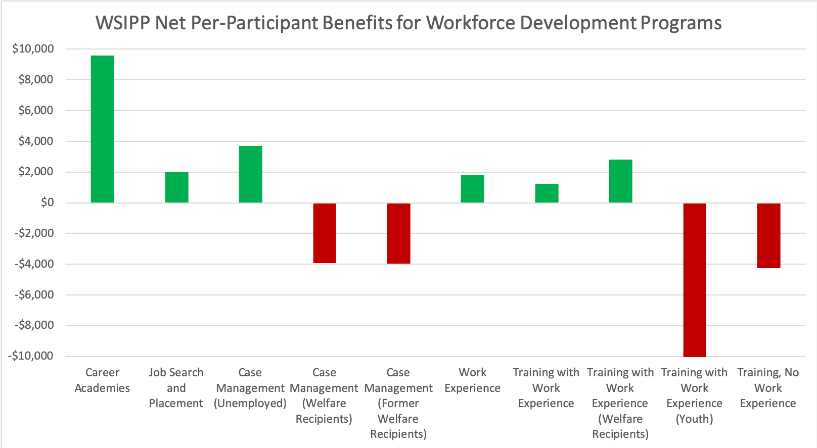
Below is an overview of the per-participant net benefits of the ten workforce development programs WSIPP has analyzed. The programs WSIPP has studied fall into four major categories: career academies, job search and placement, case management, and training/work experience. As can be seen below, WSIPP has found significant differences both between and within these categories of interventions. Let’s take a look at each of these categories one by one.
Career Academies

Career and technical education academies have been described as “school within a school” high school programs that foster connections between schools and local employers. They are designed to build both vocational and academic skill sets for students to apply in workforce and postsecondary settings. WSIPP analyzed the results of studies of California’s Career Academies and Linked Learning program for its cost/benefit estimates.

These estimates suggest that career and technical education academies yield the highest net social benefits of all the workforce interventions studied, amounting to nearly $9,600 in net benefits per participant. Benefits mainly accrue from improved labor market earnings associated with employment, about two-thirds of which accrue to participants and one-third accruing to taxpayers. Career and technical education academies also yield $2.70 per $1 invested in the program, so provide an attractive tool for policymakers working under a firm budget constraint.

The drawback of these programs is that benefits accrue over a long time horizon, estimated to take almost a decade for the program to break even, compared to instant payoff for job search and placement and case management programs and 3-5 year payoffs for training/work experience programs. Career and technical education academies are also fairly expensive, costing an estimated $5,700 per participant, ten times the cost of job search and placement programs and thirty times the cost of low-cost case management programs. This means that career and technical education programs would cost more to assist the same number of people, though the return on that cost would be larger.

Job Search and Placement

Programs that focus on job search and placement are brief interventions lasting from a few hours to two months comprised of supervised job search, job search workshops, or job clubs for unemployed individuals. These programs are usually targeted towards unemployment insurance claimants or TANF (welfare system) participants.

Job search and placement programs yield $2,000 in benefits per participant and $4.71 per dollar invested in the program, making them moderately cost-effective from a net benefits perspective and very cost-effective from a cost/benefit ratio perspective. Benefits also accrue immediately compared to the 8-year lag for career and technical academies and are cheap at about $500 per participant.

The drawback of these programs is that benefits mainly accrue to taxpayers, with taxpayers enjoying nearly three times the benefits of program participants between increased tax revenue and decreased public assistance spending. While the average participant in a job search and placement program walks away with $1,100 in increased labor market earnings, she also loses $400 in public assistance, decreasing the effectiveness of the program as an antipoverty tool.

Overall, job search and placement programs are quicker but less effective tools than career and technical academies. That being said, they represent a better tool than a status quo of inaction since they do yield benefits for both participants and taxpayers.

Case Management

Case management services usually comprise counseling and job search and retention services and referrals to work supports such as child care subsidies, transportation, education, and training. Case management can be conducted via orientations, assessments, interviews, or telephone calls in individual or group sessions.

Interestingly, WSIPP’s estimates for the cost effectiveness of case management hinge strongly on the characteristics of the participants. Unemployed individuals benefit greatly from case management, accruing $2,700 in labor market benefits at the cost of only $200 per participant. Current or former welfare recipients, in contrast, only only accrue an average of $200 in labor market earning benefits at a much higher cost of about $3,000 per participant.

The takeaway from these findings is that case management programs can be quite effective, but only if targeted towards unemployed individuals and not current or former welfare recipients.

Training/Work Experience

Training and work experience are what we usually think of when we talk about workforce development. These services may comprise job search and placement assistance, adult education, English as a second language, GED, vocation training, child care, transportation, and paid and unpaid jobs. Programs can start with training and then move to work experience, consist of an individualized employment plan from an employer, or just consist of job training or work experience.

Work experience on its own is a moderately effective intervention, yielding a net of $1,600 in labor market earnings per participant after subtracting benefit reductions. Adding training to a work experience program makes the benefits per participant higher (a net of $5,100 after subtracting benefit reductions), but the higher costs associated with training lead to lower net benefits than work experience on its own. Targeting work experience/training interventions towards welfare recipients can lead to higher social yields, though, due to decreased spending on public assistance. This makes this sort of targeting attractive to state and federal policymakers, but potentially less attractive to local policymakers who have less to gain from reductions in public assistance spending.

Targeting work experience and training interventions towards youth yield substantial net costs to the tune of over $10,000 per participant. This is because these interventions are especially costly when targeted towards youth and have very low yields to the tune of only about $150 per participant. Training without work experience has large labor market benefits per participant of $6,000 per participant, but are incredibly costly, making the approach much less attractive than work experience-focused interventions.

Takeaways

Overall, WSIPP’s analysis leaves us with some good guidance for policymakers looking to reduce poverty through workforce interventions. First, career and technical academies are incredibly effective but long-term investments in workforce. Policymakers looking for cheaper, quicker interventions can invest in case management specifically targeted towards unemployed individuals and job search and placement programs. As far as training/work experience programs go, work experience is a key ingredient and should generally be supported, except when targeted towards young people, who do not tend to benefit from such programs. A mixture of short- and long-term interventions could be a good formula for improving skills to reduce poverty.

How Local Governments Can Create High-Paying Jobs for Residents

How do we create living wage and high-paying jobs for residents of neighborhoods of concentrated poverty? One tool we have are business incentives, or, as leading national business incentive economist Timothy Bartik describes them, “tax breaks, cash grants/loans, or services that are (1) targeted at an individual firm, or some industry or group of firms, and (2) intended to promote job growth in a state, or in a local geographic area that is big enough to be a local labor market.”

Business incentives are a (some may say “the”) key tool for creating good jobs at the local level, but economists estimate that anywhere from 75-98% of business incentives have no impact on the decisions of firms to relocate, expand, or retain workers.

In light of this discouraging evidence, local policymakers are right to ask how they can use business incentives more effectively. One of the things that makes Bartik a leader not just in business incentives but in policy research in general is his willingness to put his money where is mouth is and lay out proposals for better policy on the topic he studies. In his recent book Making Sense of Incentives: Taming Business Incentives to Promote Prosperity, Bartik lays out his proposal for an “ideal state incentive program.” While this is tailored to state governments, lessons can be gleaned for local governments as well.

Target distressed areas with high unemployment

Jobs in distressed areas are more likely to go to local residents. Bartik suggests targeting counties, but at the local level, counties and municipalities may want to target certain zip codes or census tracts based on unemployment, poverty levels, or other indicators of economic distress. In particular, looking at objective measures that areas lack adequate jobs can be good guidance for local governments.

Start with basic services supporting economic development

Bartik suggests prioritizing general economic development services over funding services for specific businesses, specifically mentioning infrastructure and high-quality programs for skills development. This is a suggestion that can be directly adopted by local government. Neighborhoods of concentrated poverty often have poor infrastructure, making them unattractive for business. Investment in road and utility infrastructure can improve the ability of these neighborhoods to attract business. These neighborhoods also tend to have lower education levels, so skill training services provided or subsidized by city or county agencies could help improve workforce prospects in neighborhoods and provide partners for businesses interested in locating or expanding in these neighborhoods.

Next, prioritize funding for customized business services

Bartik suggests block granting state funds to counties, but at the local level, these funds could probably be managed by a development agency. He suggests funding be spent on services for “tradable industries”. This means that industries should compete in state or national markets: funds spent on firms that compete locally just shift jobs around the local market rather than bringing new business to the region.

Bartik mentions the following examples of customized business services: manufacturing extension services, small business development centers, business incubators, customized job training, and discretionary hiring subsidies for firms that hire into newly created jobs local nonemployed residents referred and placed via local workforce agencies. All these are strategies that can be used by local governments, especially small business services, customized job training, and hiring subsidies.

Lastly, Bartik suggests a level of funding for these customized services that would provide quality services to all targeted firms. His suggestion is $10 billion nationally. Scaled down on a per-person basis to an example jurisdiction like Franklin County, that would come out to $40 million spent on customized business services, which amounts to about 9% of the county budget—a significant number. For reference, raising this amount of new funds from county sales taxes, the broadest tax the county raises, would require an increase in the county sales tax rate from 1.25% to about 1.4%.

Make tax incentives limited in costs, up front, and open to tradable firms of all sizes

It should go without saying that tax incentives should not exceed the amount owed to local government, but having an explicit policy can keep costs from spiraling out of control. Bartik also suggests making payments up front and using clawbacks to enforce performance measures. This is because businesses value present dollars greater than future dollars, so incentives are more effective if they are front-loaded rather than accruing years down the road. Bartik also recommends making incentives a legal entitlement or having specific provisions that level the playing field between smaller and larger firms.

These are just four suggestions, but the takeaway is this: business incentives can be done better with smarter targeting, more attention to infrastructure and customized services, and prudent policy around tax incentives. Strategies such as these can pay off for residents of neighborhoods of concentrated policy.

Mapping Neighborhoods of Concentrated Poverty in Franklin County

Mapping technology has contributed a lot to understanding the impact of geography on public well being. Luckily, you don’t have to be a GIS whiz to work with geographic data. The US Census Bureau provides a pretty solid tool for analyzing geographic disparities.

For instance, let’s look at the way poverty is distributed throughout Franklin County, Ohio, using only Census Bureau tools. Below you can see a map of poverty prevalence in Franklin County generated using the Census Bureau’s tools. To generate this map, I simply used the American Fact Finder’s search for census tract five-year average poverty rates from 2017 then chose an arbitrary point - 25% poverty, and split the census tracts accordingly. I played with a few different poverty thresholds and tried three classes and four classes, but I think this two-category split best shows the concentration of poverty within the county.

Figure 1. Concentrated Neighborhoods of Poverty in Franklin County

Figure 1. Concentrated Neighborhoods of Poverty in Franklin County

Zooming in, we can see which neighborhoods have the most concentrated poverty. Overall, this visualization suggests six neighborhoods of concentrated poverty: Downtown/Near East Side, the East Side, the South Side, the West Side, Linden, and Ohio State Campus.

Downtown/Near East Side

Figure 2. Concentrated Poverty in Downtown/East Side

Figure 2. Concentrated Poverty in Downtown/East Side

Besides a little pocket in the King-Lincoln district, every census tract from the Scioto River to Alum Creek and between I-70 and I-670 is over 25% poverty. This may seem surprising to people talking about the “gentrification” of what is coming to be called “Old Towne East” along with the rapid building of downtown condos, but poverty is still quite persistent on the Near East Side and downtown. These numbers may change, though, over the coming years. Since this data lags back to 2012 in order to increase sample size, there is a possibility we will see this area start to turn more green in the coming decade.

East Side

Figure 3. Concentrated Poverty on the East Side

Figure 3. Concentrated Poverty on the East Side

Poverty on the East Side stretches from the Fifth Avenue neighborhoods north of Bexley to the neighborhoods east of James Road and west of Yearling Road in the Eastmoor/Whitehall area all the way down to the old Eastland Mall area. While the west side of Whitehall has tracts of concentrated poverty, the east side of Whitehall is notably better off.

South Side

Figure 4. Concentrated Poverty on the South Side

Figure 4. Concentrated Poverty on the South Side

South side neighborhood poverty is an interesting story. You can see the Brewery District, German Village, Schumacher Place, and Merion Village neighborhoods around Schiller Park are all under 25% poverty, but to the east in Southern Orchards and to the south in Hungarian Village, we still see concentrated poverty. We also see concentrated poverty in the Driving Park and Alum Creek Road areas to the southeast and even poverty stretching all the way down the Lockbourne Road area before it gets to Obetz and South High Street all the way down to the 270 loop. With development around Parsons Road, some are wondering if the Southern Orchards area will see declines in poverty rates, but poverty still seems to be persistent in the area for the time being.

West Side

Figure 5. Concentrated Poverty on the West Side

Figure 5. Concentrated Poverty on the West Side

Concentrated poverty on the West Side of Columbus is kind of a tale as old as time. Tracts of concentrated poverty predominate Franklinton and much of the greater Hilltop area and even the tract hugging the west side of the Scioto River opposite Marble Cliff. Notable are two tracts of concentrated poverty outside the 270 loop, signaling some suburban concentrated poverty on the West Side. A bright spot is the Westgate area, which is experiencing lower poverty rates than Greater Hilltop around it. Eyes will be on Franklinton as large development projects may impact local poverty rates in East Franklinton over the next few years.

Linden

Figure 6. Concentrated Poverty in Linden

Figure 6. Concentrated Poverty in Linden

Linden is another neighborhood that has garnered a lot of attention for its poverty. The area of concentrated poverty centered in Linden also spills over into the Northland, North East, and North Central areas. Many City of Columbus antipoverty projects have been centered in the Linden area, likely because of its geographic size and the extent of concentrated poverty in the area.

Ohio State

Figure 7. Concentrated Poverty in the Ohio State Campus Area

Figure 7. Concentrated Poverty in the Ohio State Campus Area

Probably the strangest neighborhood of concentrated poverty in Franklin County is that around the Ohio State University campus. As we’ve written before, college student concentration can impact poverty rates quite substantially, so much so that the Census Bureau has written briefs on how college students impact poverty rates. Dealing with college poverty can be deceiving because it is often (but not always!) temporary, volitional, and maybe even incorrect. Place-based poverty interventions in this neighborhood should likely take different forms than those in other neighborhoods due to the unique circumstances of poverty in a college area.

As you can see, some simple mapping can tell you some very interesting stories about poverty in a place like Franklin County. Using maps like this can help guide policymakers towards place-based policies to reconcile these geographic disparities. But place-based approaches need to be tailored towards specific neighborhoods. For instance, a keen eye may have noticed a dot of red on the southern border of Franklin County that didn’t get an analysis here. Well that tract covers the Rickenbacker National Guard Base, which means the “poverty” problem here is quite different from that in Linden or on the West Side. This type of mapping only gets you so far on its own: you need to marry this geographic data with an understanding of the local conditions each neighborhood is facing in order to craft smart place-based antipoverty policy.

Childcare Subsidies Can Be an Effective Anti-Poverty Tool

Over the past few years, child care and early education have emerged as key public policy problems. This trend has come about in a time of increased participation in the workforce by mothers and rising costs for childcare.

With the growth of childcare as a public policy problem, child care subsidies have become a larger part of US antipoverty policy. In particular, child care subsidies help families fight poverty in two ways: by providing parents with resources and by giving children a boost that leads to wage growth down the road.

Child care subsidies reduce current poverty

A child care or preschool slot provided for free to a family has the effective value of $9,500 in Ohio. This makes the total benefit for a family with two children ($19,000) higher than the average social security benefit ($17,000 annualized), the average unemployment benefit ($16,000 annualized), the average disability benefit ($9,000), the average Medicare benefit ($8,000), the average Affordable Care Act tax credit benefit ($6,000), the average Medicaid benefit ($6,000), the average Pell Grant ($4,000), the average earned income tax credit ($3,000), and the average SNAP (formerly “food stamps”) benefit ($3,000 annualized).

Data sources linked above

Data sources linked above

While one child in public childcare eclipses seven of nine major safety net items above for the average recipient, two children in public childcare makes public childcare the most generous major safety net measure in the United States, worth 91% of the value of the federal poverty level for a family of three, even though public benefits such as child care benefits are not counted in measuring income towards the official poverty measure. Child care subsidies are an important tool for reducing poverty among poor families directly.

Child care subsidies alleviate intergenerational poverty

In addition to supporting families today, child care subsidies can be a tool for fighting intergenerational poverty. High-quality early childhood education has been shown in experimental settings to have wage benefits down the road for low-income children in particular in addition to crime and health benefits. In Timothy Bartik’s book Investing in Kids, the labor economist models a universal pre-k program with income-based fees, coming to the conclusion that the long-term wage boost to low-income children would be 11,000 times as large as the wage boost to high-income children as a function of previous expected wages.

If child care subsidies are progressive and ensure proper quality, they can be an effective tool for breaking intergenerational poverty.

Poorly deployed childcare subsidies can hurt families and children

While these results seem to paint a rosy picture for child care as a tool for equity, results from Canada should give us some pause. In the late 1990s, Montreal instituted a universal child care program without any quality controls. An analysis comparing Montreal to other provinces after the reform found children to have higher anxiety and aggression and worse development scores and health outcomes after the reform, while parents exhibited more hostile, inconsistent parenting behaviors along with less parental satisfaction and even higher levels of maternal depression. One of the possible explanation for these results is that children were getting less time to interact and build strong relationships with parents at young ages.

The balance of the evidence suggests that childcare subsidies smartly deployed can be a strong tool for reducing family and intergenerational poverty. That being said, subsidies should be deployed with caution in order to ensure that they are targeted towards high-quality programs and that they do more to encourage rather than discourage positive family interactions.

No, Columbus is not a startup city

Columbus’s startup community gets a lot of love, and we at Scioto Analysis like to celebrate it as well,as a startup ourselves. With that in mind, I was surprised when a colleague at lunch yesterday told me Columbus has one of the weakest startup industries in the country.

Of course, I went straight for the data. The Ewing Marion Kauffman Foundation publishes a comprehensive annual report on startup activity by metro area. Using IRS data collected by the Bureau of Labor Statistics, Kauffman compiles the “startup density” of the top 40 metro areas in the country, defined as the number of firms less than a year old that employ at least one person besides the owner per 1,000 total businesses.

Columbus’s startup density is in the bottom quintile nationally, only outpacing five other metro areas: Cincinnati, Providence, Milwaukee, Pittsburgh, and Cleveland. While the average large metro area has 83 startups per 1,000 businesses, Columbus punched in at 66 startups per 1,000 businesses in 2017, 20% lower than that average. Columbus looks a little better when you compare it to other regional metro areas, but still only falls in the middle of the list of seven metro areas in Ohio and neighboring states.

Picture1.png

But doesn’t Columbus have a strong job market? And don’t small businesses drive job growth? Not so fast. By compiling jobs data from the Bureau of Labor Statistics, we can see that Columbus’s employment growth was basically flat from 2017-2018, placing it in the bottom quintile of large metro areas in job growth ahead of only San Diego, New York, Sacramento, Chicago, and Pittsburgh. Columbus even looks weak regionally, especially compared to high-growth Indianapolis and even against other Ohio cities Cincinnati and Cleveland.

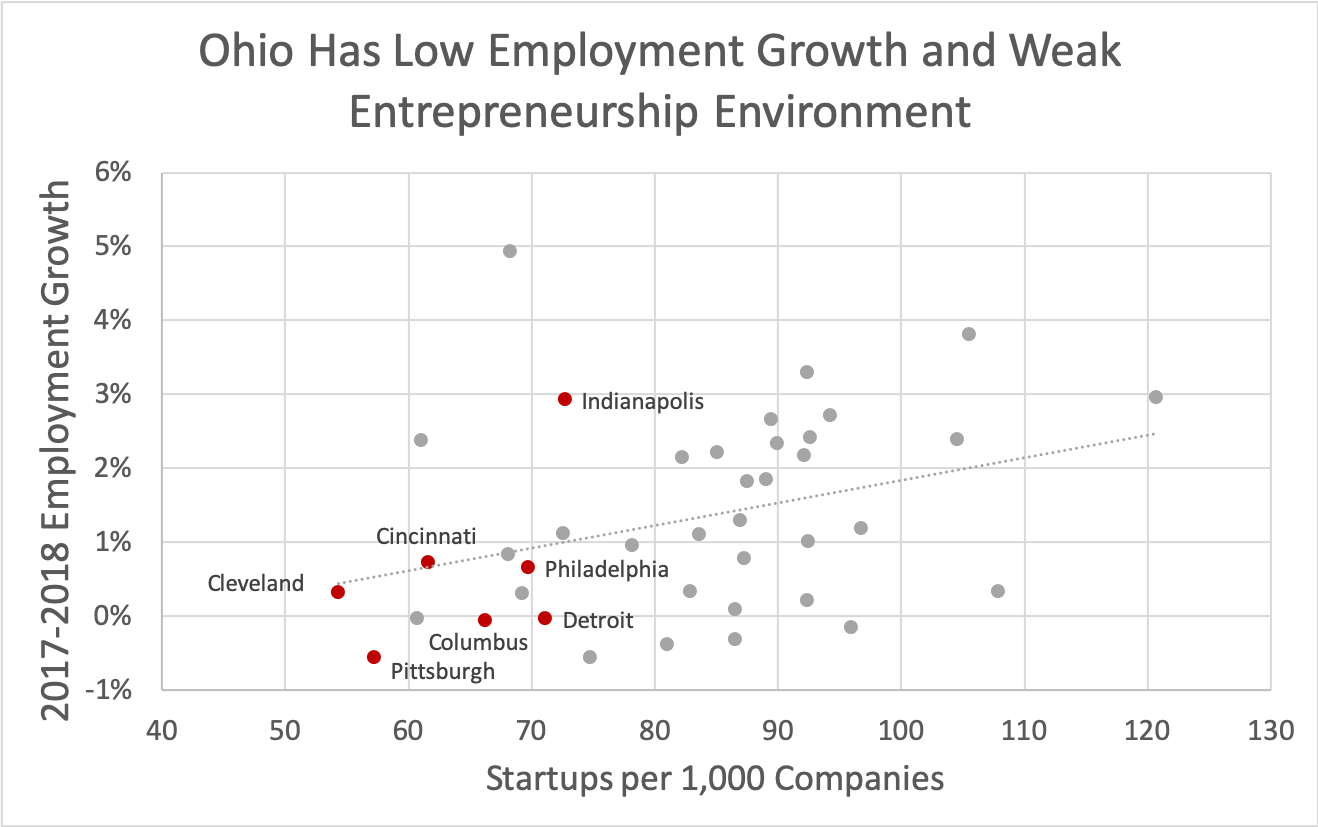
Finally, let’s look at the relationship between the two variables. Using a standard correlational analysis, we can see that there is a weak relationship between startup density and job growth. Among our regional metro areas, six are clumped in the bottom left quadrant, showing low levels of both startup density and job growth compared to other large metros nationally. While Cleveland, Cincinnati, and Philadelphia follow the national trend fairly well, Pittsburgh, Columbus, and Detroit each have more sluggish job growth than their startup density would predict. Also note Indianapolis, which has 12% more startups per 1,000 businesses than the average regional city, but four times the job growth as the average regional city, making it the regional outlier.

scatterplot.png

Despite all these troubles, Columbus continues to grow in population and economic activity. It may have been that 2018 was a particularly bad year for Ohio, so these trends could reverse in 2019. That being said, it is hard to truly make the case that Columbus is a startup Mecca. Columbus is merely average regionally and quite weak nationally when it comes to startup prevalence.

The Top 5 Studies of Scioto Analysis's First Year

Today, Scioto Analysis celebrates its first birthday. Over the past year, Scioto Analysis has served clients in five different states and has analyzed issues ranging from tax to health and human services to environmental and education policy. Below are Scioto Analysis’s top five studies of its first year.

  1. Waiting for Services: Nebraska’s Developmental Disabilities Waiting List
    In October, Scioto Analysis partnered with Disability Rights Nebraska and the Nebraska Consortium for Citizens with Disabilities to study the waiting list for developmental disability services in the state of Nebraska. While all Nebraskans with developmental disabilities are entitled to services to help with every day living, gaining capacity, and employment, the average Nebraskan with disabilities waits seven years to get these services. In this study, Scioto Analysis found that this was due to a $33 million shortfall in state spending from 2008 to 2016 that caused the state waiting list for services to slowly grow over that time period.

  2. Earned Income Tax Credit Refundability: A Cost-Benefit Analysis
    As a social enterprise, Scioto Analysis is committed to improving the quality of public policy analysis at the state and local level, which includes demonstration projects of key analytical techniques. This August study was the first best-practices cost-benefit analysis of a state policy in Ohio in over a decade. Scioto Analysis found that proposals to expand Ohio’s state earned income tax credit would raise the average worker’s wages by hundreds of dollars along with growing the economy, increasing employment, increasing college enrollment, and reducing instances of low birthweight.

  3. Ohio’s Economy: 2009-2016
    While gross domestic product is the most common indicator used to measure economic growth in the United States, it leaves out key economic considerations such as the cost of inequality and environmental damage and the value of housework and higher education. The genuine progress indicator (GPI) is an alternative indicator that measures economic growth through 26 different economic, environmental, and social indicators. When Scioto Analysis launched in November last year, it partnered with Gross National Happiness USA to measure Ohio’s GPI since the Great Recession. Scioto Analysis found that rising inequality had taken a significant bite out of Ohio’s economy since the end of the great recession, costing the average person about $900 a year.

  4. Cost-Benefit Analysis in Ohio: Building State Policymaking Infrastructure
    In order to carry out its double bottom line mission, Scioto Analysis carried out a study in April assessing Ohio’s use of cost-benefit analysis in state policymaking. Scioto Analysis identified 27 studies from 2012 to 2018 that at a very minimum assessed direct costs and measured outcomes, though did not find any studies that followed the eight best practices of cost-benefit analysis.

  5. Beyond the Gas Tax: How Automation Opens the Door for Vehicle Miles Traveled Fees
    In March, Scioto Analysis released a white paper on vehicle miles traveled fees for autonomous vehicles. By taking advantage of the efficiency gains of automation and the availability of data due to computerization, state and local governments will have new opportunities very soon to implement the “holy grail” of capturing the costs of driving.

It’s been a great first year for Scioto Analysis and more high-impact analysis is in the works. Stay tuned to see what great stuff we have in store for the upcoming year!

Let's Talk about Benefits Cliffs

If you’ve been to a public meeting about poverty, you’ve probably seen someone stand up and smugly let you know about a little thing called a “benefits cliff.”

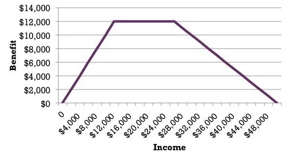
If you haven’t heard of a benefits cliff, here’s a simple explanation: a well-designed social welfare program has a “phase out” schedule. The idea is that if you make more money, you slowly lose your benefit. Take the earned income tax credit. The earned income tax credit slowly phases out for people making more income so that beneficiaries of the credit don’t lose all their money at once. 

Figure 1. EITC Model

Figure 1. EITC Model

Compare this to a program like SNAP (formerly “food stamps”), which has a strict income cutoff, after which you are no longer eligible for the program. So in Ohio, if a single worker makes $16,000 in a year, she is usually eligible for about $2,400 in food assistance, making her effective income $18,400. But if she crosses that wage threshold and make $16,500, she loses her benefit, meaning her effective income drops by almost $2,000—just for getting a raise! 

Figure 2. SNAP Model

Figure 2. SNAP Model

Emily Campbell of the Center for Community Solutions is Ohio’s resident expert on benefit cliffs. She had modeled benefits cliffs for different family sizes and has presented extensively on the topic. As you can see from the graphic below, benefit reductions should theoretically slow income growth at many points in the income distribution.

Figure 3. Center for Community Solutions Benefits Cliff Model

Figure 3. Center for Community Solutions Benefits Cliff Model

 In particular, according to this model, we should see a lot of single-parent two-child families “clumping” at about $17/hr annualized, which equals about $35,000. This is because, according to this model, making anywhere from $35,000 to $56,000 annually results in the same net income, so less work is better in this situation.

When I studied this problem as my capstone in graduate school, I found some evidence of clumping in publicly-available income data, but the effects were small. While there is a lot of theory and anecdotal evidence of the impact of benefits cliffs on work output and human capital development, there is little empirical evidence to demonstrate these impacts are actually happening.

Reasons to be skeptical about arguments about the impact of the benefits cliff include behavioral explanations. Human beings are pretty lousy at interpreting the tax and benefit system. It’s hard to make the argument on one hand that low-income people need financial literacy training and on the other hand that they are deciphering a complex benefits system to maximize their return for a given work input.

That being said, it is hard to argue the benefits cliffs have no impact at all. In my capstone work, I did detect some evidence for limited “clumping” at certain incomes which could have been driven by benefits cliffs incentives. So what do we do about these design problems?

The first step is to acknowledge them for what they are: design problems. It is pretty easy to redesign programs to phase out benefits rather than reducing them all at once: it’s just a change in the benefits schedule. The state of Ohio did it recently with child care benefits, albeit in a convoluted way by only allowing the phase-out range to apply to previous recipients (take your kid out of child care for a month and get a raise? Lose your benefit) and thus building in a strange incentive for benefit continuity. That being said, the new program creates less negative incentives than the last. Smart design can prevent these problems from occurring in the first place.

States are more hamstrung with federal programs like SNAP which have strict income cutoffs which states generally don’t have the flexibility to change. This is where states need to get creative. Case management combined with targeted cash or in-kind transfers can help supplement income when benefits disappear, creating bridges towards sustainable middle-class incomes. But the best way to deal with a benefits cliff is to make sure it doesn’t exist in the first place, which means good design at the onset of a program.

Rob Moore is the principal for Scioto Analysis.

Ohio's Water Quality Still Lags Other States

Last year, Scioto Analysis conducted a study of Ohio’s economy using an alternative, “GDP+” framework called the “genuine progress indicator”. This was the first Genuine Progress Indicator study in Ohio since 2012 and tracked Ohio’s recovery from the Great Recession, calculating the size of the economy in every year from 2009 to 2016 using 26 different economic, environmental, and social indicators.

That same year, researchers at the University of Vermont calculated a “point-in-time” measure for all fifty states for the year 2011. The nice thing about this report is that we can use this data to compare Ohio’s economy compared to the economy of the other 49 states.

On most indicators, Ohio is characteristically pedestrian, falling within half a standard deviation of the state mean per-capita cost or benefit. For four indicators, though, Ohio deviates from the average state, and all but one of these are in a negative direction.

Water Pollution
Ohio’s worst indicator compared to other states is water pollution. The cost of water pollution to the average state resident in Ohio in 2011 was $219 compared to $139 for the average state, one and a half standard deviations higher than the mean. This should not be surprising for those who lived through the Cuyahoga River Fire, but these numbers show that Ohio’s water pollution struggles are far from ancient history. Water quality has become a problem recently as algae blooms in Lake Erie and other lakes have cost Ohioans in property values, tourism industry, and natural resources. University of Toledo Economist Kevin Egan has proposed a phosphorus tax to capture the cost of runoff where it begins, but state policymakers have shied away from the proposal, leaning towards regulations and education.

Personal Consumption
The largest portion of the genuine progress indicator is personal consumption expenditures, or consumer spending on goods and services, which makes up over a third of gross impacts in the measure. The average Ohioan spent about $31,000 on goods and services in 2011, compared to about $34,000 for the average state, making this also the largest single shortfall for Ohio compared to other states in absolute terms, but also among the highest in relative terms as Ohio’s personal consumption expenditures per capita were three-quarters of a standard deviation lower than the average state. This may be a symptom of higher poverty and lower incomes in Ohio than the average state.

Motor Vehicle Crashes
The bright spot in this report is that Ohio experiences less motor vehicle crashes than the average state. In 2011, Ohio had about 9 fatal crashes per 100,000 people, compared to the average state that had 12 fatal crashes per 100,000 people (about two-thirds of a standard deviation lower). This means Ohio had less medical costs, time lost at work, and most importantly deaths per person than the average state, leading to savings of about $1,500 per person. It’s hard to say exactly what is causing the lower crash levels in Ohio, but with Wyoming, North Dakota, and Montana all experiencing the higher rates of over 20 fatal crashes per 100,000 people, it may have to do with density or speed limits.

Higher Education Attainment
Back to the bad news: Ohioans are generally less educated than the average state. In 2011, about 25% of Ohio’s adult population had a bachelor’s degree or higher, compared to about 28% for the average state, which makes Ohio’s attainment rate about half a standard deviation lower than the average. This leads to an a lost $400 per capita in greater civic engagement, longer life expectancy, better child education, and more optimal family sizes. This may owe to Ohio’s history as an industrial state and its reliance on industries that require less education than others. If Ohio’s higher education attainment rate was the same as the average state, Ohio would have about a quarter million more bachelor’s degrees in its workforce. The Ohio Department of Higher education has set a goal to reach 65% attainment of working-age degree, certificate, or workforce credentials by 2025, which could mean a half million more bachelor’s degrees in the state workforce.

Ohio doesn’t do terribly in this comparative analysis, but it does provide room for improvement: Ohio has models in other states that have less water pollution, stronger consumer economies, and more educated workforces. Ohio should be happy, though, that motor vehicle crashes are not as bad as they are in other states. One limitation of this data, though, is that the most recent study only captured information from 2011. Ideally, the federal government, through the US Bureau of Economic Analysis, would conduct a 50-state analysis of state genuine progress indicators every year. Until then, we will lean on independent analyses done by the University of Vermont, Scioto Analysis, and other firms to provide us with this key economic information.

Scioto Analysis Partners with Nebraska Disability Groups on Study

On Tuesday, Disability Rights Nebraska and the Nebraska Consortium for Citizens with Disabilities released a study with Scioto Analysis on Nebraska’s waiting list for developmental disability services.

Citizens with disabilities in Nebraska are entitled to receive residential, habilitation, and vocational services from the state, but the state does not always provide these services at the time of need for people with disabilities. Because of these delays, the average Nebraskan with disabilities waits nearly seven years to receive services from the state necessary for everyday functioning.

“Nebraska has a strong history of investing in educational, medical and related services and supports for children and youth with disabilities from date of diagnosis through age twenty-one,” said Disability Rights Nebraska Chief Executive Officer Eric Evans, Ph.D. “Despite this commitment to young Nebraskans with intellectual/developmental disabilities, today over 2,300 children, youth and adults are waiting for essential services beyond their need date.”

The study found that the state has made strides on developmental disabilities, but fell short of legislative workgroup recommendations for developmental disability funding by about $33 million over the past ten years, causing the backlog.

“If the state had not had this shortfall in spending, this wait list would not exist,” said Scioto Analysis Principal and study author Rob Moore.

This study will inform Disability Rights Nebraska and the Nebraska Consortium for Citizens with Disabilities’s efforts to reduce the waiting list and improve access to services for people with developmental disabilities in the state of Nebraska.

Ohio in the Middle of the Pack in Higher Education Spending

Last week, the Pew Charitable Trusts released an issue brief on U.S. higher education funding. In this brief, the Trusts presented some valuable information on state-level education spending.

Using this data, we can compare higher education spending in Ohio to higher education spending in neighboring states.

Ohio is fairly middle of the pack when looking at per-student spending on higher education. Ohio spends about $10,000 more per student than Indiana and West Virginia and about $10,000 less per student than Michigan and Pennsylvania. Ohio’s per-student spending is closer to Kentucky, which spends about $2,500 more per student than Ohio. This is a little surprising since Kentucky is more poor and Indiana is more wealthy than Ohio as a whole.

Data from the Pew Charitable Trusts

Data from the Pew Charitable Trusts

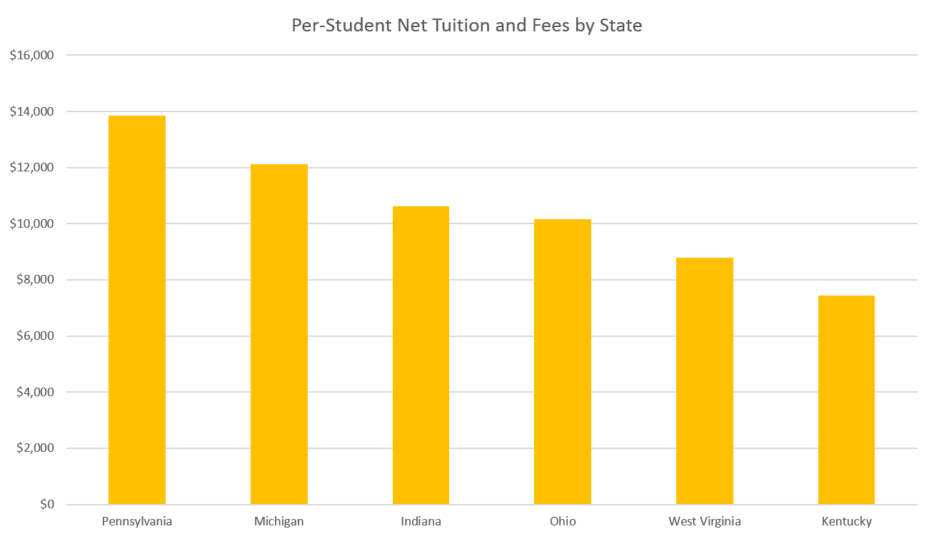
Ohio falls in the same place in the pecking order when just looking at per-student tuition costs, with tuition in Ohio a few thousand more than in Kentucky and a few thousand less than in Pennsylvania. Here, though, you see higher education spending rates more matching poverty rates, with Kentucky and West Virginia charging less for tuition and Pennsylvania more.

Data from the Pew Charitable Trusts

Data from the Pew Charitable Trusts

Michigan is a bit different than you would expect, though, with higher tuition despite being a medium-poverty state for the area. While Michigan and Ohio’s median incomes and poverty rates are both nearly identical to one another, college tuition is much higher in Michigan than in Ohio.

Tax spending, or state revenue spent on higher education, is a different picture. Here, you see Kentucky and West Virginia spending more of their state taxes on higher education than Michigan and Pennsylvania, suggesting that Michigan and Pennsylvania lean more on student tuition to fund higher education while Kentucky and West Virginia fund more of their higher education through taxes. Indiana is the exception here, putting forth more tax revenue and charging higher tuition than the average state in the region. Ohio, like other measures, is middle of the road.

Data from the Pew Charitable Trusts

Data from the Pew Charitable Trusts

Federal revenue is the only category where Ohio falls behind each of its neighboring states, only bringing in about $3,400 in federal revenue per student. Interestingly, Michigan and Pennsylvania, which have the highest tuitions and contribute the least in state taxes towards higher education, also receive the most per-student in federal funding. This is likely because of federal research grants, which tend to be won by top-tier research institutions, which are more common in Michigan and Pennsylvania than other states in the region.

Data from the Pew Charitable Trusts

Data from the Pew Charitable Trusts

Since the economic benefits of basic research are more likely to bleed across state lines than human capital from higher education, this trend follows sound economic logic. That being said, federal dollars also include financial aid dollars, so this suggests that research dollars are overwhelming financial aid dollars in these states. From a local standpoint, these numbers also show that Ohio is a less attractive place for the federal government to invest its resources than any of its neighboring states.

Disparities in funding become very clear when looking at the impacts of private gifts and investments on state higher education funding. Ohio only draws about half as much income on a per-student basis from gifts and investments as Michigan does. For Kentucky, that number is only about a quarter.

Data from the Pew Charitable Trusts

Data from the Pew Charitable Trusts

Finally, let’s look at the oddest category of revenue: self-supporting operations. Self-supporting operations include revenue from the operation of campus services (e.g., residence halls, intercollegiate athletics, and college stores), hospitals, and independent operations. While Ohio generates a few thousand dollars per student less in self-supporting operations than Kentucky, Pennsylvania, or Michigan, it generates much more than Indiana and West Virginia, which each only generate about $4,000 in self-supporting operations revenue per student. This suggests that either on-campus amenities or independent operations such as hospitals are dramatically less prominent in Indiana and West Virginia than the other four states in the region.

Data from the Pew Charitable Trusts

Data from the Pew Charitable Trusts

Overall, the most striking pattern in this data is Ohio’s normality. In nearly every category, Ohio falls in the middle of the region, with the notable exception of federal funding. This suggests that Ohio could do more to bolster its work as a research state, though it could also suggest a focus on teaching in the state over research. Another explanation is that the state may be doing less than other states to help students take advantage of federal financial aid, which, if true, could exacerbate inequality in the state.