Scioto Analysis Partners with Nebraska Disability Groups on Study

On Tuesday, Disability Rights Nebraska and the Nebraska Consortium for Citizens with Disabilities released a study with Scioto Analysis on Nebraska’s waiting list for developmental disability services.

Citizens with disabilities in Nebraska are entitled to receive residential, habilitation, and vocational services from the state, but the state does not always provide these services at the time of need for people with disabilities. Because of these delays, the average Nebraskan with disabilities waits nearly seven years to receive services from the state necessary for everyday functioning.

“Nebraska has a strong history of investing in educational, medical and related services and supports for children and youth with disabilities from date of diagnosis through age twenty-one,” said Disability Rights Nebraska Chief Executive Officer Eric Evans, Ph.D. “Despite this commitment to young Nebraskans with intellectual/developmental disabilities, today over 2,300 children, youth and adults are waiting for essential services beyond their need date.”

The study found that the state has made strides on developmental disabilities, but fell short of legislative workgroup recommendations for developmental disability funding by about $33 million over the past ten years, causing the backlog.

“If the state had not had this shortfall in spending, this wait list would not exist,” said Scioto Analysis Principal and study author Rob Moore.

This study will inform Disability Rights Nebraska and the Nebraska Consortium for Citizens with Disabilities’s efforts to reduce the waiting list and improve access to services for people with developmental disabilities in the state of Nebraska.

Ohio in the Middle of the Pack in Higher Education Spending

Last week, the Pew Charitable Trusts released an issue brief on U.S. higher education funding. In this brief, the Trusts presented some valuable information on state-level education spending.

Using this data, we can compare higher education spending in Ohio to higher education spending in neighboring states.

Ohio is fairly middle of the pack when looking at per-student spending on higher education. Ohio spends about $10,000 more per student than Indiana and West Virginia and about $10,000 less per student than Michigan and Pennsylvania. Ohio’s per-student spending is closer to Kentucky, which spends about $2,500 more per student than Ohio. This is a little surprising since Kentucky is more poor and Indiana is more wealthy than Ohio as a whole.

Data from the Pew Charitable Trusts

Data from the Pew Charitable Trusts

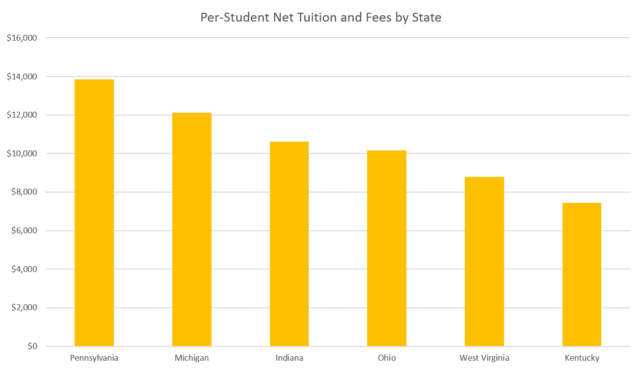
Ohio falls in the same place in the pecking order when just looking at per-student tuition costs, with tuition in Ohio a few thousand more than in Kentucky and a few thousand less than in Pennsylvania. Here, though, you see higher education spending rates more matching poverty rates, with Kentucky and West Virginia charging less for tuition and Pennsylvania more.

Data from the Pew Charitable Trusts

Data from the Pew Charitable Trusts

Michigan is a bit different than you would expect, though, with higher tuition despite being a medium-poverty state for the area. While Michigan and Ohio’s median incomes and poverty rates are both nearly identical to one another, college tuition is much higher in Michigan than in Ohio.

Tax spending, or state revenue spent on higher education, is a different picture. Here, you see Kentucky and West Virginia spending more of their state taxes on higher education than Michigan and Pennsylvania, suggesting that Michigan and Pennsylvania lean more on student tuition to fund higher education while Kentucky and West Virginia fund more of their higher education through taxes. Indiana is the exception here, putting forth more tax revenue and charging higher tuition than the average state in the region. Ohio, like other measures, is middle of the road.

Data from the Pew Charitable Trusts

Data from the Pew Charitable Trusts

Federal revenue is the only category where Ohio falls behind each of its neighboring states, only bringing in about $3,400 in federal revenue per student. Interestingly, Michigan and Pennsylvania, which have the highest tuitions and contribute the least in state taxes towards higher education, also receive the most per-student in federal funding. This is likely because of federal research grants, which tend to be won by top-tier research institutions, which are more common in Michigan and Pennsylvania than other states in the region.

Data from the Pew Charitable Trusts

Data from the Pew Charitable Trusts

Since the economic benefits of basic research are more likely to bleed across state lines than human capital from higher education, this trend follows sound economic logic. That being said, federal dollars also include financial aid dollars, so this suggests that research dollars are overwhelming financial aid dollars in these states. From a local standpoint, these numbers also show that Ohio is a less attractive place for the federal government to invest its resources than any of its neighboring states.

Disparities in funding become very clear when looking at the impacts of private gifts and investments on state higher education funding. Ohio only draws about half as much income on a per-student basis from gifts and investments as Michigan does. For Kentucky, that number is only about a quarter.

Data from the Pew Charitable Trusts

Data from the Pew Charitable Trusts

Finally, let’s look at the oddest category of revenue: self-supporting operations. Self-supporting operations include revenue from the operation of campus services (e.g., residence halls, intercollegiate athletics, and college stores), hospitals, and independent operations. While Ohio generates a few thousand dollars per student less in self-supporting operations than Kentucky, Pennsylvania, or Michigan, it generates much more than Indiana and West Virginia, which each only generate about $4,000 in self-supporting operations revenue per student. This suggests that either on-campus amenities or independent operations such as hospitals are dramatically less prominent in Indiana and West Virginia than the other four states in the region.

Data from the Pew Charitable Trusts

Data from the Pew Charitable Trusts

Overall, the most striking pattern in this data is Ohio’s normality. In nearly every category, Ohio falls in the middle of the region, with the notable exception of federal funding. This suggests that Ohio could do more to bolster its work as a research state, though it could also suggest a focus on teaching in the state over research. Another explanation is that the state may be doing less than other states to help students take advantage of federal financial aid, which, if true, could exacerbate inequality in the state.

Why Preschool Teacher Wages are So Low

People have been talking for years about wages for early childhood educators. Preschool teachers in Ohio last year made an average of less than half the wage of K-12 teachers. The average preschool teacher’s salary only amounts to 112% of the federal poverty level for a family of four, meaning that many preschool teachers are likely below the poverty line and most are low-income.

This seems counterintuitive given the research available on the returns to early childhood education compared to interventions later in life.

The other side of this conversation, though, is the cost of early childhood education. A recent study by the RAND corporation suggests that high-quality early childhood education education costs anywhere from $3,600 per student to $13,400 per student. This means the average worker in Ohio making $48,000 a year would have to spend 7-28% of income per child on early childhood education.

Labor makes up a considerable portion of the cost of child care, with estimates in the range of 60-80% of total program costs going to teacher salary and benefits. Using the RAND estimates of the cost of high quality early education, we can then estimate that teacher salary and benefits cost anywhere from $2,200 to $10,700 per student.

Using the above Bureau of Labor Statistics data, we can see that kindergarten and elementary school teachers are each paid more than twice as much as preschool teachers. This means that increasing preschool teacher wages to kindergarten or elementary parity would increase teacher salary and benefit costs to $4,000 to $23,000 per student and total costs (assuming equipment, administration, and occupancy costs stay the same) to $6,000 to $26,000 per student per year. This increases the per-child burden of early education to anywhere from 12-53% of the median wage in Ohio.

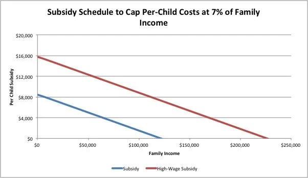
The Federal Department of Health and Human Services has previously established seven percent of family income as a benchmark for child care affordability. This means families up to $190,000 in family income (nine times the federal poverty level) could be considered cost burdened by child care under high estimates of the cost of child care. A flat per-child subsidy capping costs per child at seven percent and assuming an average cost of care of $8,500 would extend up to families making $120,000 per year (six times the federal poverty level), while a per-child subsidy aiming to increase teacher wages to elementary school levels would extend to families making up to $230,000 per year (11 times the federal poverty level).

SubsidySchedule.jpg

According to the Annie E. Casey Foundation, there were 690,000 children in Ohio age 0-4 in 2018. A subsidy capping the per-child cost of care at seven percent of income would cost an average of about $5,000 per child at current costs and $12,000 per child at a subsidy aiming to increase teacher wages. An age 0-4 subsidy program capping per-child costs at 7% of family income in the state of Ohio would cost about $3.6 billion at current costs and $8.6 billion at costs aiming to increase teacher wages. For reference, the state of Ohio spent $2.5 billion on higher education and $7.5 billion on K-12 education in 2018. This means that a current-costs subsidy to cap per-child expenses at 7% of income would have cost the state more than any other state program besides K-12 education and Medicaid ($16 billion in 2018) and a subsidy program aimed at boosting teacher wages would cost the state more than any program besides Medicaid.

The dilemma of child care public finance is pretty clear: increasing teacher wages drives up the cost of care, which has to be either picked up by families or by the state. From an economic perspective, this makes perfect sense: if the social benefits of early childhood are sufficiently high, we should see underinvestment in the early childhood market without sufficient public sector intervention. States can choose two of the three options between high wages for teachers, low costs for families, and low levels of state spending. Having all three can only occur through outside federal investment financed by either new taxes or further deficit spending.

Scioto Analysis Principal Rob Moore Profiled in APPAM's "Five Minutes With..." Series

Last week, Scioto Analysis Principal Rob Moore was profiled in the Association for Public Policy Analysis and Management’s “Five Minutes With…” series.

In the interview, Moore talked about what attracted him to the field of public policy analysis.

“Policy analysis is a great place for people who have the engineering mindset but an interest in making society as a whole better,” said Moore.

Moore also spoke about analysis’s place in the democratic process.

“In a democracy, interest groups and public opinion have a role, but good policy requires political interests to be balanced with facts about the impacts of policy,” Moore said. “Scioto Analysis is a firm that provides these facts to policymakers who want them and promotes better analysis at the state and local level.”

Moore went on to talk about the future of public policy, talking about the rise of equity analysis and the growth in cross-disciplinary analysis.

“Over the next thirty years or so, I expect public policy to improve its rigor and expand its insights in the fields of human development and well-being,” said Moore. “If we can better understand how policies impact development metrics such as education, health, and housing and food security along with subjective assessment of well-being, we can craft policy that responds not only to the classical economic concept of getting people what they want but also to helping people live independent, fulfilling lives.”

The Association for Public Policy Analysis and Management is the leading association for public policy analysts, managers, and researchers in the United States. Made up of over 2,500 members, the association is dedicated to improving public policy and management by fostering excellence in research, analysis, and education.

What does “give people money" really look like?

During his presidential campaign, tech entrepreneur Andrew Yang has brought an old/new idea to the foreground of public policy: basic income. Yang’s “Freedom Dividend” is the most high-profile basic income proposal since Richard Nixon’s Family Assistance Plan.

But giving everyone in America $1,000 dollars a month isn’t the only way to fight poverty. As a matter of fact, it’s not the only way to give people cash.

The most common way we give working people cash in the United States is through the Earned Income Tax Credit. The Earned Income Tax Credit is a tax credit given to working people under a certain income threshold. The credit is limited to working people by increasing in generosity at the lower end of the income distribution, leveling off, then decreasing as people make more income. Below, you can see what an Earned Income Tax Credit could look like maxing out at $1,000 a month.

Figure 1: Earned Income Tax Credit Model

Figure 1: Earned Income Tax Credit Model

Currently, the federal government, 29 states, DC, Guam, and Puerto Rico all have versions of the Earned Income Tax Credit. Scioto Analysis conducted a cost-benefit analysis last summer on Ohio’s Earned Income Tax Credit and has analyzed recent Earned Income Tax Credit changes in the state of Ohio. As an antipoverty tax break that encourages work originally passed by a Democratic Congress and signed by a Republican President, the Earned Income Tax Credit has traditionally enjoyed bipartisan support.

Older than the Earned Income Tax Credit is guaranteed income, also known as a “negative income tax.” Famously trumpeted by Milton Friedman as a solution for administrative waste in the social welfare system in the United States, guaranteed income provides an “income floor” for low-income people then draws down as people make more money.

Figure 2: Guaranteed Income Model

Figure 2: Guaranteed Income Model

Guaranteed income provides more support for people at the bottom of the income distribution than the earned income tax credit and does not pull people into the workforce the same way that the earned income tax credit does. A guaranteed income was proposed by Richard Nixon in the early 70s and even passed the House of Representatives but stalled in the Senate and never became law.

A newer proposal that turns the guaranteed income concept on its head is the “Universal Earned Income Tax Credit” proposed by Syracuse University Economist Leonard Burman. Rather than starting with a grant and then taking it away as income goes up, the Universal Earned Income Tax Credit gives cash as income goes up and never takes it away as incomes increase.

Figure 3: Universal Earned Income Tax Credit Model

Figure 3: Universal Earned Income Tax Credit Model

The universal earned income tax credit would encourage low income people to work while supplementing their incomes and would not be very targeted, going to a lot of high-income people as well as low-income people. Nothing like the universal earned income tax credit has been implemented before.

Lastly, universal basic income. Universal basic income is a no-strings-attached, no phase-in, no phase-out cash transfer to all people. Universal basic income has picked up in the public policy conversation over the past few years fueled by both poverty advocates and Silicon Valley futurists worried about the future of work.

Figure 4: Universal Basic Income Model

Figure 4: Universal Basic Income Model

Universal basic income has had pilots since the 1960s and is currently being tested in Finland and California. The most famous basic income in the world is probably the Alaska Permanent Fund, a fund financed by Alaskan oil revenues that makes direct payments to all Alaskans in the state, regardless of income.

Graphic from Business Standard

Graphic from Business Standard

Another variation worth noting is a conditional cash transfer. Conditional cash transfers are usually targeted to geographic areas of need and are awarded on condition of completing socially beneficial activities such as school attendance, primary care screenings, and vaccinations. Since they usually do not interact with other income, they work much like a universal basic income in theory with an added incentive to carry out the conditions of the benefit. Conditional cash transfers are much more common in middle- and low-income countries and the Global South.

Giving $1,000 a year to every person is one way to do cash transfers, but it is hardly the only way. The earned income tax credit, guaranteed income, universal earned income tax credit, universal basic income, and conditional cash transfer approaches all have benefits and drawbacks. They all share one big benefit, though: providing families who need them cash to deal with the contingencies of life.

Poverty among Ohio and its Neighbors in Four Charts

It’s fall again and like most years, Ohio is king when it comes to college football. But fall in the wonk world means something different: new poverty statistics.

Last week, the United States Census Bureau released new data on income, poverty, and health insurance coverage at the state and local level across the United States. The release was data from the American Community Survey, the preview survey of US population, workforce, and housing.

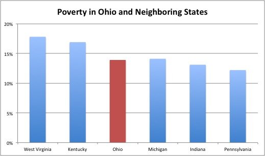
This new data gives us a snapshot of Ohio’s poverty rate compared to other states. The national poverty rate in 2018 was 13.1%, a mark only beat by Pennsylvania (12.2%) among Ohio and its neighbors. Indiana’s poverty rate was right at the national poverty rate while Michigan and Ohio’s were statistically identical at about a point above the national poverty rate. West Virginia and Kentucky had the highest poverty rates in the region and were respectively the fourth and sixth poorest states in the country.

Data from U.S. Census Bureau’s American Community Survey

Data from U.S. Census Bureau’s American Community Survey

Rates of child poverty nationwide are higher than rates of working-age poverty, which are higher than rates of poverty for older adults. Looking at Ohio and its neighboring states, though, we can see that child and working-age poverty rates vary more wildly among states than older adult poverty rates. While child and working-age poverty rates are around 50% higher in West Virginia than in Pennsylvania, the older adult poverty rate is only 20% higher in West Virginia than it is in Pennsylvania. This might owe to the fact that the nation’s largest antipoverty program, social security, addresses poverty among older adults more than working-age adults and children.

Data from U.S. Census Bureau’s American Community Survey

Data from U.S. Census Bureau’s American Community Survey

Ohio and all its neighboring states have median household incomes lower than the national average. Median household income follows a similar pattern as poverty rates, with one major exception: Indiana has the second lowest poverty rate among Ohio and its neighboring states, but it has the fourth highest median income. This suggests Indiana has less inequality than Ohio and Michigan.

Data from U.S. Census Bureau’s American Community Survey

Data from U.S. Census Bureau’s American Community Survey

By splitting up households in these states into high-income, middle-income, and low-income households, we can learn something about the distribution of income among households. I split these households up using the Pew Research Center’s definition of “middle class”, two-thirds to twice the median income. This came out to households under $35,000 in annual income being classified as “low income,” households from $35,000 to $100,000 in annual income being classified as “middle income,” and households with greater than $100,000 in annual income being classified as “high income.”

Data from U.S. Census Bureau’s American Community Survey

Data from U.S. Census Bureau’s American Community Survey

There are so many takeaways from this chart. First, Ohio again looks dead similar to Michigan. Secondly, the middle-income population is fairly steady state to state, fluctuating between 42% of the total population in West Virginia and 47% of the total population in Indiana. By contrast, the high-income and low income populations fluctuate by 11 and 12 percentage points respectively between Pennsylvania and West Virginia.

Here you can see why Indiana has lower median income than Ohio and Michigan: it has the largest middle class of any state in the region. It also has the same proportion of low-income residents as Ohio and Michigan but less high-income residents.

Kentucky looks somewhat better using income measures than poverty measures. It has a lot of people in poverty, but also has more high-income people than West Virginia, making its distribution fall somewhere between West Virginia and Ohio/Michigan.

Finally, Pennsylvania is the only state where the high-income population nearly eclipses the low-income population. This coupled with its second-smallest middle class among states in the region suggests some persistent inequality despite having a smaller low-income population than all other states.

Using all these measurements, Ohio falls in the middle regionally when it comes to income and poverty, with higher incomes and lower poverty than West Virginia and Kentucky, lower incomes and higher poverty than Pennsylvania and Indiana, and identical in nearly every way to Michigan. Maybe they’re right when they say familiarity breeds contempt.

How can the state of Ohio reduce homelessness?

Over 10,000 Ohioans experience homelessness in any given day. While President Trump has raised California’s 130,000 homeless as a national issue, three quarters of the country’s homeless live outside of California and need strategies for addressing homelessness, too.

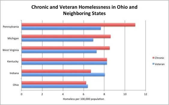
Let’s start with some good news. Populations many cities have prioritized when fighting homelessness are veterans and chronic homeless. On both of these counts, Ohio compares favorably to its neighbors, experiencing lower rates of both veteran and chronic homelessness than all of its neighboring states.

Overall, though, Ohio’s rate of homelessness and gross number of homeless is larger than all of its neighboring states besides Pennsylvania, even though Ohio’s poverty rate is lower than poverty rates in Kentucky, Michigan, and West Virginia.

So what can Ohio do about homelessness? The state has three explicit strategies it can pursue to reduce the number of people experiencing homelessness in Ohio.

Expand Emergency Housing Capacity

Emergency housing is a key tool for providing support to those experiencing intermittent homelessness. Emergency housing provides shelter, food, case management, health care, and housing assistance among other services. A 2004 study by the Lewin Group found that emergency housing cost about $25 per bed per day to operate. Adjusting for inflation, this comes out to about $34 per bed per day in 2019. This means that, for the cost of about $13 million, the state could pilot a program to provide emergency housing for 10% of the state’s homeless population.

Target Chronic Homelessness

Chronic homelessness is a different beast, usually exacerbated by mental illness, substance use disorders, and disability. Taking a bite out of chronic homelessness requires ongoing supportive housing that will prevent people from falling back into homelessness. Supportive housing required to tackle chronic homelessness houses homeless on a more ongoing basis, providing case management and employment services along with housing and utilities.

Utah’s effort to tackle chronic homelessness has reduced their chronic homeless population by over 90%. Using the same Lewin Group study’s estimate for the cost of supportive housing inflated to 2019 dollars, the state could create a program to reduce chronic homelessness by housing 90% of its chronic homelessness at a first-year cost of about $10 million.

Tackle Housing Affordability

While the previous two strategies are reactionary, the state can also take steps to make housing more affordable. Ohio is lucky to have a relatively low cost of living compared to other states across the country, which has kept average spending on housing below the “30% threshold” that can lead to elevated rates of homelessness. That being said, growth in areas like the Columbus metro area could lead to housing shortages. Strategies such as allowing for denser development like those taken by the state of Oregon and the City of Minneapolis recently could make it easier for developers to build more housing to meet demand. Housing subsidies to families could provide similar benefits, though at a cost to taxpayers.

None of these strategies will solve homelessness on their own, but they will reduce the number of people living in homelessness in Ohio, maybe even significantly. As Ohio sees increases in housing prices following the rest of the country, it will be incumbent on the state to be forward-thinking in how it handles this issue.

The State of Ohio's Investments in the 2010s in Five Graphs

In June, the federal Congressional Budget Office released its periodic report on federal investment—a report that catalogs federal spending on physical capital, education, and research and development over time and compares it to the growth of the overall economy. After seeing this report, I was interested in seeing how Ohio’s state investments compared.

The Ohio Legislative Service Commission provides historical data on Ohio’s revenues and expenditures going back to 1975 for operating funds and 2008 for capital funds. In order to mirror a previous study we did on the state economy, I looked at data from 2009 to the present to look at state investments throughout Ohio’s recovery from the Great Recession.

Unfortunately, the Legislative Service Commission does not provide readily-accessible data on state research and development spending. That being said, the agency does a good job of making physical capital and education spending available. Below are some of the takeaways I had looking at this data.

1. Total physical capital and education spending is down 11% in the past decade. In inflation-adjusted terms (using the Bureau of Labor Statistics’ CPI-U measure), the state spent 11% less on physical and human capital in 2019 than in 2009. This is driven by a $600 million reduction in education spending and a $700 million reduction in physical capital spending over that time period. Spending on physical and human capital is up $1.1 billion in 2019 from its nadir in 2012, but has not reached 2009 levels in real terms.

Data from Ohio Legislative Service Commission

Data from Ohio Legislative Service Commission

2. Reductions in education spending over the past decade were driven by higher education cuts. While K-12 real expenditures were flat from 2009 to 2019, higher education spending was cut by 23% over the time period. Reductions in higher education expenditures made up almost half of the total reduction in combined human and physical capital over the past decade.

Data from Ohio Legislative Service Commission

Data from Ohio Legislative Service Commission

3. Reductions in physical capital spending were driven by school facility investment cuts. The state of Ohio spend almost $900 million less on school facilities in 2019 than in 2009, representing two-thirds of the net reduction in human and physical capital spending over the decade. This may have been due to a “catch-up” period in K-12 facility building in the late 2000s or may represent a policy decision to reduce facility spending.

While K-12 facility cuts cuts were partially offset by increases in investment in natural resources, corrections, and transportation capital, they weigh down total physical capital spending, leading to an over 40% reduction in physical capital spending from 2009 to 2019. While physical capital investment is up $175 million from its low point in 2013, it was lower in 2019 than any year since 2014.

Data from Ohio Legislative Service Commission

Data from Ohio Legislative Service Commission

4. State human and physical capital investment has declined as a percentage of Gross State Product (GSP) over the past decade. Taken as a percentage of GSP, or total economic output for the state as reported by the Bureau of Economic Analysis, state human and physical capital investment is down almost a full percentage point from 2009 to 2018 (the most recent year we have BEA GSP data for), a reduction of one third of its previous level. Spending as a percentage of GSP has not had the recovery that human or even physical capital has, reaching 1.7%, its lowest point over the time period, in 2018. This could mean that more investments are being made privately, but also means the state is investing less in capital that could have economic spillovers or equity benefits for the population.

Data from Ohio Legislative Service Commission and the Bureau of Economic Analysis

Data from Ohio Legislative Service Commission and the Bureau of Economic Analysis

5. State human and physical capital investment has declined as a percentage of Genuine Progress Indicator (GPI) over the past decade. GPI is an economic growth indicator that adjusts for factors not included in GSP that have known economic impacts like environmental damage, the value of unpaid housework and child care, and the cost of family breakdown. GPI in Ohio is currently calculated by Scioto Analysis and data is available through 2016. Using this measure as the calculation for the size of the economy, human and physical capital investment is down by a percentage point from 2009 to 2016, which only amounts to a reduction of a fifth of state human and physical capital investment as a share of the economy as a whole. Much of this, though, owes to slower GPI growth over the period fueled by rising inequality, culminating in a GPI “recession” in 2016. The slower growth in GPI thus makes the reduction in human and physical capital investment by the state look smaller as well, though investment is still lower in 2016 than in 2009.

Data from Ohio Legislative Service Commission and Scioto Analysis

Data from Ohio Legislative Service Commission and Scioto Analysis

Overall, the Legislative Service Commission data suggests that the state of Ohio has reduced human and physical capital investment over the past decade. Total real human and physical capital investment, human and physical capital investment as a share of the economy, human capital investment, physical capital investment, and K-12 facility spending are all down in the past decade, while K-12 non-facility investment is flat and there have been smaller increases in natural resource, corrections, and transportation investments. This signals a belief among current policymakers that investments are not the most effective strategy for reducing market failures or achieving equity goals over the period of recovery from the Great Recession.

Poverty and Car Ownership in Ohio's Cities

In 2016, one in six households in Ohio’s six largest cities did not have a car. This number varied between cities in the state, though: in Columbus the number of households without a car was less than one in ten while in Cleveland the number approached one in four.

Part of this is a story about poverty. Higher-poverty cities tend to also have lower levels of car ownership nationally, and this is a trend that we see among Ohio cities as well.

Data from the US Census Bureau as reported by Governing Magazine and the Ohio Development Services Agency.

Data from the US Census Bureau as reported by Governing Magazine and the Ohio Development Services Agency.

This data should not be especially surprising: it is well established that higher incomes lead to greater levels of car ownership. Something to take away from this data is that car ownership is still rather prevalent among poor households. Even if all houses without cars were poor, anywhere from a quarter to over half of all poor households in each city own a car.

On implication of this data is for financing of mass transit. One of the justifications given for public financing of mass transit is redistributionary: that mass transit is disproportionately used by the poor and thus financing for mass transit serves as a mechanism for promoting equity. This data, though, shows how imprecise this method is for achieving equity. Add the fact that taxes used to pay for mass transit tend to be regressive sales taxes, and we can see that much of our mass transit system is financed by poor families with cars.

Another implication is that gas taxes may not be as regressive as they are often pitched. While a lot of poor households own cars, many also do not, which means that a gas tax to capture infrastructure, congestion, fatality, and emission costs with a low-income rebate could be more progressive than we often assume.

Scioto Analysis Releases Ohio Handbook of Cost-Benefit Analysis

On Tuesday, Scioto Analysis released the Ohio Handbook of Cost-Benefit Analysis, a handbook for policy analysts in the state of Ohio interested in adding cost-benefit analysis to their policy analytic toolkit.

The Handbook provides an overview of the theory behind cost-benefit analysis, standard formulas used in cost-benefit analysis, and a checklist for those carrying out a cost-benefit analysis.

“Analysts in Ohio interested in cost-benefit analysis will be able to use this guide as a quick and dirty introduction to the practice,” said Rob Moore, principal of Scioto Analysis. “Cost-benefit analysis is a key tool for bringing numbers to the discussion on budgetary and regulatory decisions policymakers need to make.”

Last Spring, Scioto Analysis conducted a study of the use of cost-benefit analysis in the state of Ohio, finding 27 studies from 2012 to 2018 that measured costs and projected some sort of outcomes of state-level policies. None of these studies, though, followed all the best practices of cost-benefit analysis. Scioto Analysis’s cost-benefit analysis on the state earned income tax credit released last month was the first best-practices cost-benefit analysis carried out on a state program in Ohio in over a decade.

“More resources like these will make it easier for analysts to conduct cost-benefit analyses according to best practice: monetizing costs and benefits against a baseline, discounting, conducting sensitivity analysis, and disclosing assumptions,” said Moore. “We look forward to seeing the improved analysis that this handbook makes possible.”