
Back in 2022, we released a study on inequality in Ohio and a few policy options that could impact it. This was one part of our series studying different ways to understand the economy, as well as reports on human development, poverty, subjective wellbeing, and the economic growth.

We are currently working on updating the inequality study, and as part of that we are calculating the Gini Coefficient for Ohio.
The Gini coefficient is a numerical measure of inequality, most commonly used to describe how evenly income or wealth is distributed within a population. It ranges from 0 to 1, where 0 represents perfect equality (everyone has the same amount of income) and 1 represents perfect inequality (one person has all income, and everyone else has no income). The Gini coefficient is a useful summary statistic to assess income inequality, though it can be a little esoteric and hard to understand by itself. That’s why today I wanted to explain what the Gini Coefficient is and why it’s so important to understand inequality.
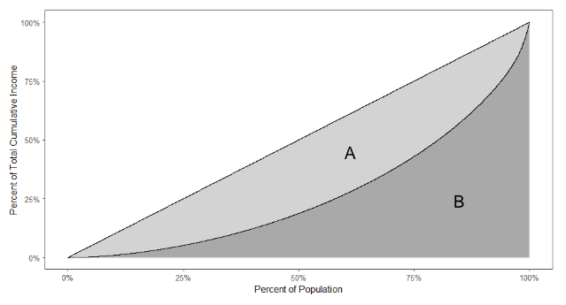
To understand the Gini Coefficient, we first need to take a detour and talk about the Lorenz Curve. The Lorenz Curve was introduced in 1905 by economist Max Lorenz as a way to represent income or wealth inequality graphically. The Lorenz Curve plots the cumulative income held by the bottom X% of a population. For example, we might be able to say the bottom 50% of the population cumulatively has 25% of the total income in some region.
Below is an example of what a Lorenz Curve looks like in practice. The straight line shows what perfect equality would look like in theory, while the curved line shows the empirical Lorenz curve.
When a Lorenz curve is shown, it’s often plotted alongside a straight line that shows what perfect equality looks like. If this chart is difficult to understand, it may be easier to consider the straight line case first. In this case, if you have say the bottom 25%* of the population and add up all their income, then those people cumulatively have 25% of the total income of the whole population. The curved line represents the real data in some place. Above we see that the bottom 60% or so of the population has 25% of the total income. The closer the curved line is to straight, the more equal the income distribution is.
This curve is the basis for the Gini Coefficient, which was first developed by Corrado Gini in 1912. The Gini Coefficient is defined as the ratio of the area between the perfect equality curve and the Lorenz Curve divided by the total area under the perfect equality curve. In the image above that is equal to A / (A + B).
This term has many nice mathematical properties. It’s straightforward to calculate, it is bounded between 0 and 1, and it allows us to easily compare Lorenz curves from different populations. Without the Gini Coefficient, you’d have to stare at two charts and try to determine minute differences between curves. Instead, we can just look at this one metric and see whether one area has more or less income inequality than another.
The Gini Coefficient is not the only important factor when studying inequality, but it does provide a lot of information. As we progress with our updated inequality study for Ohio, we will dig deeper into what’s driving these patterns and how they’ve shifted over time. By pairing the Gini Coefficient with other measures and exploring the policies that shape economic outcomes, we hope to offer a clearer sense of what might actually move the needle on inequality in Ohio.
*In cases where people have the same income, their order can be determined randomly in order to calculate the cumulative income percentage.