
In poverty and inequality circles, redlining is often one of the first things mentioned when talking about why racially-correlated urban inequality exists today. When I previously wrote a blog post about mapping poverty in my hometown of Saint Paul, I mentioned the impact of redlining on current patterns of inequality in the city.

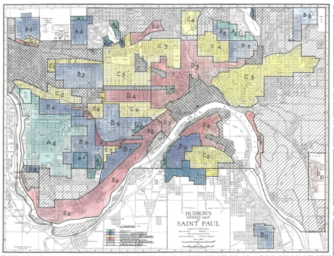
Redlining as most people know it refers to a series of maps produced by the Home Owners’ Loan Corporation in the 1930’s, where neighborhoods were graded by their social, economic, and physical characteristics. The neighborhoods marked in red on these maps line up with neighborhoods that today have low incomes.
However, new research on these maps shows that this commonly-held belief about these maps might be wrong.
Before digging in any further, I want to make it clear that this research does not suggest that there isn’t historical discrimination that led to the spatial trends we see in urban areas. Instead, this research tries to show that the Home Owners’ Loan Corporation maps are not the main culprit.
What are the Home Owners’ Loan Corporation maps?
During the Great Depression, the Home Owners’ Loan Corporation was established as part of the New Deal in order to help prevent a total housing market collapse. Their goal was to purchase failing mortgages from banks and restructure them so people could stay in their homes.
The Residential Security Maps and their color-coded neighborhoods were created in an attempt to measure the riskiness of neighborhoods instead of individual borrowers. To determine the riskiness of a neighborhood, the evaluators looked at features like housing quality, access to public transportation, economic characteristics of the people who lived there, and the race of the people who lived there.
It is true that almost all majority black neighborhoods in the cities evaluated by the Home Owners’ Loan Corporation were given the lowest grade, but it is important to remember that in the 1930s, discriminatory housing practices largely kept people of color out of urban areas. The majority of the lowest-rated neighborhoods were almost exclusively white immigrant neighborhoods with poor housing conditions.
In the predominantly black neighborhoods during those years, housing conditions were even worse. This means that even if those neighborhoods were not predominantly black, they would have still received the lowest rating because of their housing conditions.
In fact, during the time that the Home Owners’ Loan Corporation was purchasing mortgages, they did a fairly admirable job of providing assistance indiscriminately. This is not to say that they were actively supporting disadvantaged communities, but they purchased a proportionate amount of loans from the lowest rated neighborhoods.
This begs the question though, if these maps were not made with discriminatory housing practices in mind, what were they for?
Unfortunately, there isn’t a satisfying answer to this question. By the time these maps were completed, the Home Owners’ Loan Corporation was largely out of the mortgage business. The maps weren’t shared with private lenders, and although they were shared with the Federal Housing Administration (which did participate in discriminatory housing practices), that agency had its own set of maps, and the available historical evidence suggests that they didn’t use the Home Owners’ Loan Corporation maps.
Why are these maps correlated with modern disadvantaged communities?
The history lesson above is fascinating, but it doesn’t explain why the Home Owners’ Loan Corporation maps are strongly correlated with modern day low-income neighborhoods. If they weren’t used to perpetuate discrimination, how did we get here?
The answer lies in understanding what the maps were actually measuring: housing quality.
Remember, when the maps were made, predominantly black neighborhoods were rare in America’s cities. Racist housing policies largely kept people of color out of the cities altogether.
This changed after World War II when we saw one of the most dramatic realignments of people in the United States. The simultaneous impacts of the Second Great Migration and White Flight completely changed the demographics of American urban environments.
The discriminatory housing practices that kept people of color out of the cities vanished and were replaced with new discriminatory housing practices that kept them out of the newly built suburbs. White families from the cities started leaving en masse, leaving vacancies for black households.
Before this migration, black urban neighborhoods had a lot of economic diversity. It largely didn’t matter how much money black households had, the racist housing policies made sure they all lived in the same neighborhoods.
During the migration, black households had a new opportunity to choose where they lived. Black urban neighborhoods became economically separate, and wealthy black households had the opportunity to move into the higher-rated neighborhoods.
Another key factor was that in the lowest-rated neighborhoods, far more families left for the suburbs than moved in to replace them. This led to housing abandonment and disinvestment in these neighborhoods that helped perpetuate the economic discrimination.
So, the reason these maps line up with racial and economic disparities today is because during this massive upheaval of American cities, poor black families moved into neighborhoods with poor housing conditions that were vacated by white families who moved elsewhere. The housing markets in these neighborhoods largely collapsed due to high vacancy rates caused by fewer families moving in than previously lived there, which coupled with racist economic development policies led to disinvestments in these neighborhoods.
What does this mean for policy today?
If you believe everything I’ve said up to this point, you might still wonder why this distinction matters. At the end of the day, the Home Owners’ Loan Corporation maps line up with disadvantaged neighborhoods today, and isn’t that really what matters?
While I agree that addressing today’s problems is the most important issue, understanding how we got here can help us come up with permanent solutions.
One takeaway I get from this new understanding is that the low-income neighborhoods in our cities today were not the result of black people being forced into those places by federal agencies. They were forced into those neighborhoods because of their wallets.
We know this because wealthy black households moved into higher rated neighborhoods during the Second Great Migration. The households that moved into these lower rated neighborhoods did so because that was what they could afford to do.
Another reason it might be good to not allow these maps to influence policy today is because while the low rated neighborhoods do largely line up with low-income neighborhoods today, it’s not a perfect match. If policy were designed to only focus on the lowest rated neighborhoods from the 1930s, we’d be ignoring a lot of disadvantaged communities that don’t fall exactly in those neat lines.
Finally, focusing too much on these maps makes it so we do not accurately acknowledge the players that were responsible for racist housing policies in that era. There were bad actors who made it extremely difficult for black families to find adequate housing, and we should accurately tell that part of our history.
I would encourage anyone who has read this far to go and read the full article that helped me understand this. There is much more to this story and Alan Mallach does an excellent job communicating it. It’s always an unusual experience to have an idea that you have accepted as a fact be challenged this way. It took me a while to come around to the idea that I had been wrong about what these maps meant.