How does inequality impact well-being?

Our most recent published study looking at GPI in Ohio has received some coverage recently. As a result, I wanted to revisit it one more time to cover one of the most significant differences between GPI and GDP: the income inequality adjustment. 

In Ohio, we estimate that income inequality costs the state over $100 billion annually, by far the largest cost measured by GPI.

Taking a step back, we should think about why we want to measure the cost of income inequality. People have very different opinions about how much inequality is acceptable. Most people tolerate some of the inequality that comes with more efficient growth (e.g. employees might get small raises when their company’s profits double), but find extreme inequality undesirable.

From a theoretical perspective, this ties into the idea of the marginal utility of money, in other words how much our money is worth to our well-being. If your first thought is that every dollar is the same, consider this example. 

Imagine two people. Person A spends $300 a month on food, never goes hungry, and budgets carefully. Person B spends $3,000 a month on food and goes to expensive restaurants regularly. Is person B really getting 10 times the value from their money as person A?

We should expect person B to have some added value from their extra $2,700 a month in food spending: you don’t have to prepare your own food at a fancy restaurant and it is a form of recreation that is valuable. Still, it is unlikely that person B is getting 10 times as much value from that spending as person A.

Another way to think about it, imagine instead of person B living lavishly, they adopted the same budget as person A, and used the leftover money to feed 9 additional people on the same budget who would otherwise have to skip meals or stretch their budget to eat. Surely those people would receive more value for that money than person B otherwise would.

So how do we factor this intuitive insight into an economic model?

When calculating GPI, we follow the approach used by John Talberth and Michael Weisdorf. They propose a logarithmic adjustment for the diminishing marginal utility of income. Essentially, $100 is worth less to a rich person than a poor person, and is worth almost nothing to the people with the highest incomes.

There are a few key factors in this adjustment. First, we only adjust incomes above the median. This assumes that people earning less than or equal to median income in a given area are receiving the full economic benefit of their income.

Additionally, because of the logarithmic reduction in utility, very high earners contribute very little additional benefit to the economy with their consumption. The natural extension of this idea is that these individuals would contribute more to the society if they didn’t consume all of their resources, but rather distributed them throughout the income distribution.

A final consideration with the income inequality adjustment is that more than any other indicator, it measures the efficiency of our economy rather than the effectiveness of it. Other costs like pollution and underemployment are designed to shine a light on tangible economic activity that GDP ignores, but this adjustment is an inherently distinct concept.

Its inclusion is certainly relevant, there is research showing that including measures for inequality is important to public policy. Despite the fact that it is the most unique of all the measures in GPI, accounting for income inequality helps us better understand how our economy truly is faring.

Economists agree subsidies will improve housing affordability

In a survey released this morning by Scioto Analysis, the majority of economists agreed that a tax credit for low-income housing developers would significantly lower housing prices for low-income renters.

This policy has been a point of contention between the Ohio House of Representatives and the Ohio Senate. House lawmakers supported spending $500 million on tax credits for low-income housing developers in their most recent budget proposal, but the Senate removed this item.

Among economists who agreed, questions remained about whether this policy would be an efficient use of government resources. As Jonathan Andreas of Bluffton University wrote, “housing costs (particularly for starter homes) are higher now than they have been historically because of a supply problem… I doubt this is the most cost-effective way to increase the supply of housing, but the best way is often politically infeasible and this should increase the supply of housing.”

Charles Kroncke from Mount St. Joseph university strongly disagreed that this policy would lower prices for low-income renters, writing “only if government mandates specific rental prices. Even then, I would expect developers to have a preference for market priced developments.”

Economist opinions were mixed on the prospects of these subsidies for economic growth or reducing income inequality.

The Ohio Economic Experts Panel is a panel of over 40 Ohio Economists from over 30 Ohio higher educational institutions conducted by Scioto Analysis. The goal of the Ohio Economic Experts Panel is to promote better policy outcomes by providing policymakers, policy influencers, and the public with the informed opinions of Ohio’s leading economists. Individual responses to all surveys can be found here.

Ohio Senate budget will affect poor people on food assistance, affordable housing, and other programs

The Ohio Senate Republican budget passed last week put forth a new vision for social safety net spending in Ohio. 

The proposal suggests reduced spending on food banks, housing for pregnant women, affordable housing, and school meals for poor children. It also proposes making it harder for low-income people to get access to Medicaid, SNAP (formerly known as “food stamps”), and other public benefits.

These changes to the budget are used to fund income and commercial activity tax cuts.

When Senate President Matt Huffman was asked about this range of cuts to social services, his explanation was that he is trying to “stimulate” a conversation about sustainability of the Temporary Assistance for Needy Families fund. He expressed worry that the fund would be insolvent in five years if spending and revenue continues at current levels for years into the future.

So let’s talk about it.

Temporary Assistance for Needy Families (often shortened to “TANF”) is a relatively small program that mainly provides income to very poor Ohioans. It is the successor to the Aid for Families with Dependent Children (AFDC) program. This was the program that had gained the dreaded label of “welfare” in the early 90s.

Many politicians did not like AFDC because it gave cash to low-income families. It became a massive dog whistle punching bag for the Reagan administration, who was able to vilify it to such effect that it was ultimately the Clinton administration that finished the program, following up on a campaign promise to “end welfare as we know it.”

And he did. The new TANF program was a block grant given out to states to not only provide cash assistance, but also to pilot a range of different programs focused on getting people to work.

Early on, this change was seen as a success. Poverty abated and employment, especially among single mothers, increased. But this was the 90s–a period of economic expansion. 

The subsequent recession of the early 00s followed by the Great Recession of 2007 to 2009 exposed how these changes to the social safety net had made it less resilient and kicked out many of the supports previously in place to hold struggling families up. 

While new programs from the 90s like the earned income tax credit are a good tool for supporting families who have work, they fail when structural problems make work unavailable on a massive scale.

All this is to say Huffman has a little bit of a point here. Block granting TANF took one of the most straightforward and effective income support programs in U.S. history and capped it, limiting its potential effectiveness greatly. Now the dollars available for supporting low-income families need to come from somewhere else.

Is the answer to this problem to cut social spending left and right and use that as a tool to fund income tax cuts and cuts to commercial activity? Probably not. If the plan put forth in the Senate is adopted, it will represent a massive transfer of income from the most needy Ohioans to those with the most resources already. Seems like a big cost to try to make a point.

What makes a good economic indicator?

Earlier this week, Scioto Analysis released an updated Genuine Progress Indicator (GPI) calculation for Ohio. GPI is an alternative measure to GDP that tries to still measure how productive an economy is, while accounting for other things that either provide or take away value like leisure time and air pollution.

We found that GPI is consistently a bit lower than GDP, and over the past five years has grown by less. This seems to explain why despite fairly healthy GDP growth during the pandemic recovery, many people still seem to be struggling in our economy.

At Scioto Analysis, we believe that GPI is a more useful economic indicator than GDP, but this comes with an assumption about what the goal of an economic indicator is. So, I’d like to talk about that assumption, and try to help explain what the goal of measuring our economy even is.

I think about economic indicators like GPI and GDP as having two main goals: they should accurately describe the current state of the economy such that growth of the indicator correlates with increased well-being and they should help policymakers identify areas for improvement.

In other words, a higher score for the indicator should mean society is more well-off and the indicator should help point policymakers trying to improve well-being in the right direction.

Let’s apply this framework to another indicator to understand it better. For example, unemployment. Unemployment does a fairly good job of describing the state of our economy, and usually as unemployment goes down well-being goes up. However, as we’ve talked about before, underemployment is a major issue that goes unnoticed by our typical unemployment figure, U-3 unemployment.

Additionally, U-3 unemployment only counts people who are actively searching for jobs and ignores those who are not even trying. This is good because it means we don’t accidentally count people who aren’t working for reasons such as being a full time student, but it also means one policy option for reducing unemployment would be to discourage people from trying to work.

If we incorporate underemployment into our measure as U-6 unemployment does, then we do a better job of checking both boxes. The indicator is better correlated with well-being, and unemployment/underemployment numbers are fairly straightforward in suggesting policies to improve our society.

A similar situation arises between GPI and GDP. GDP is certainly correlated with well-being, but maybe not as much as we’d think. Additionally, GDP growth could come at the cost of decreased well-being. For example, if public health improves and fewer people end up going to the doctor then there would be less economic activity. Our society might be more well off, but GDP might not rise.

Before we can say that GPI is more correlated with well-being than GDP, we’d need to increase our sample size. Anecdotally, it seems to better represent the state of our economy, but more calculations are certainly needed before we can say for certain.

Where GPI really shines through is that it suggests much more practical policy decisions than GDP does. For example, if a policymaker is debating between two policies, GDP would always prefer the one that would lead to more growth in the formal economy. But, if that growth is only in the short term (GPI takes into account the current value of past investments) and it comes with a large non-market cost (e.g. pollution) then it might actually not be so good for our society.

By looking at a set of conditions that better reflects our understanding of what makes an economy “good,” GPI is often a more useful economic measure than GDP. It is far from perfect as it currently stands, but hopefully more policymakers will begin to ask for GPI calculations so that we can have more informed discussions about our economy.

Food insecurity in Ohio as bad as ever

Back in 2016, I conducted a policy analysis on food insecurity in Ohio.

I was drawn to this question because I saw a report from the Center for American Progress rating states on a variety of different indicators. Ohio, as it still tends to do, fell near the middle of the pack on nearly every indicator. The exception was food insecurity.

In my analysis, which I eventually published with Innovation Ohio, I looked at a few different interventions to reduce food insecurity, focusing on cost effectiveness. I settled on a program called SNAP-Ed – a nutritional financial literacy program that has been shown to have significant results at reducing food insecurity in treatment populations and has been verified by randomized controlled trials.

A lot has changed since that 2016 analysis but one thing has remained the same — food insecurity is still a significant problem in Ohio.

The COVID-19 pandemic created new challenges for families struggling with food insecurity in Ohio. On the front end, typical patterns of food consumption were upended by the drastic economic effects of large-scale economic shutdowns across the world. This led to more of a need for food bank services across the state and increased usage significantly.

The abatement of the pandemic did not lead to a corresponding abatement in food insecurity. This is because the supply chain and labor market changes accompanying the drawdown of the pandemic led to rapid increases in prices across markets. Food markets were hit disproportionately, with many food staples rising in price by double digits on a yearly basis.

This means food banks have continued to strain even after pandemic restrictions have been lifted.

We see this reality reflected in a recent survey by the Ohio Association of Foodbanks, which found that over two-thirds of food bank clients had to choose between paying for food and paying for transportation, gas, or utilities and over half had to choose between paying for food or health care or housing.

Food banks have been our plug-and-chug answer to poverty in the United States. As we’ve slowly reduced cash payments, access to benefits like SNAP (formerly known as “food stamps”), and put work requirements on benefits like government-supplied health insurance, a refrain from policymakers has been “let them have food banks.” While giving people food benefits such as SNAP to shop in grocery stores is the more straightforward policy approach, food banks appeal to a sense of charity among policymakers.

But food banks are only as useful as they are resourced. If food banks are to take the place of a more robust safety net as envisioned during the War on Poverty or that exists in most other developed countries, the state needs to sufficiently resource them so they can provide food for clients.

A problem with the food bank model is that if demand for services outstrips supply, the only adjustment they can make is increase wait times. This is because the limit on food bank services does not only come from lack of food, but also from labor to distribute the food. So low-income people have time they could spend looking for work, developing skills, or caring for family members waiting in line so they can eat. This is not a productive use of time.

In an ideal world, we have a robust safety net that provides income support for people who fall into poverty and that integrates people into society so poverty does not persist across the generations. In absence of this, sufficient funding for food banks is the bare minimum we could provide to give people a chance to escape poverty.

This commentary first appeared in the Ohio Capital Journal.

Ohio’s Genuine Progress Indicator helps explain economic anxiety

This morning, Scioto Analysis released an updated Genuine Progress Indicator (GPI) calculation for the state of Ohio over the past five years. GPI is an alternative to GDP for measuring the wellbeing of an economy, including consideration for environmental and social conditions. 

In recent years, a shortcoming of GDP is that it has overstated the strength of the post-covid economic recovery. Many Ohioans are still feeling the negative effects of the pandemic, despite the fact that state GDP has grown significantly over the past two years. 

Conversely, GPI reveals a less optimistic picture of the wellbeing of the economy during this time – more in line with what people are actually experiencing. Since 2018, GPI has only grown by 8% compared to almost 24% for GDP. 

One of the most significant reasons GPI has been lower than GDP in recent years is the cost of income inequality in Ohio. In 2022, income inequality was valued at almost $150 billion. This comes after a large spike in inequality during the pandemic. 

This is counterbalanced by some positive trends in GPI as well. Personal spending on durable goods and other forms of investment stayed fairly constant despite the pandemic. This meant that the multi-year services people receive from big purchases like cars and homes has continued to provide steady value to the economy during this time. 

“GDP fails to explain people’s lived experience in the economy today. Productivity is correlated with wellbeing, but it’s not the whole story,” said Michael Hartnett, the study’s co-author. “Our study helps demonstrate that in the United States, GPI can help get our indicators more closely aligned with what we actually value in society.”

The Launch of the RISE Together Innovation Institute

Since the beginning of this year, we have been working on a project with the RISE Together Innovation Institute, a new poverty alleviation center in Franklin County. The institute was created as part of a strategic plan led by Franklin County to help improve conditions for people in poverty.

RISE began in 2019 when the Franklin County board of commissioners convened community leaders to assemble a roadmap for reducing poverty. The roadmap settled on 13 goals to strive for, covering the categories of work, health, housing, and youth. 

The RISE Together Innovation Institute (formerly known as the Innovation Center) was charged with being the body that worked with key stakeholders and community members to put the roadmap into action. 

Today, RISE is led by CEO Danielle Sydnor, an advocate and community leader. Danielle began her career in the banking industry, but has for many years been working in community organizations working to improve people's lives. In addition to her work in Columbus, Danielle is the most recent past president of the Greater Cleveland Branch of the NAACP.

Scioto’s work with RISE began with a project to gather data and develop statistics for their website which launched earlier this month. We created a snapshot of what poverty looks like in Franklin County to better contextualize what problems exist and help dispel some of the most common misconceptions about poverty.

Some of the key takeaways from our report have already been published, but the full document is still going through some final edits before publishing.

All of this research culminated last week in the second annual Poverty Innovation Summit. At the Summit, participants discussed some potential policies that RISE could focus on trying to implement in the county. The three policies they discussed were paid parental leave, medical debt forgiveness, and accessory dwelling units. 

These policies were all chosen because they already have some local traction in policy circles and they help advance the original roadmap’s goals of improving work, health, and housing respectively. 

Another reason these policies are exciting is because they are all fairly well-researched. One of our core beliefs at Scioto is that there needs to be more evidence-based policy in state and local government, so it’s exciting that organizations like RISE are stepping up and helping make that a reality. 

Going forward, we are excited to continue to work with RISE and research new ways to help alleviate poverty in Franklin County, as Scioto’s principal Rob Moore is the new policy analyst in residence with RISE.

This commitment to evidence-based policy is one of the many reasons the RISE Institute is an extremely exciting organization. Their commitment to community engagement and well-researched policies and support from the Franklin County government means they could have a strong possibility of improving conditions for people in poverty. 

There is still lots of work to be done in Franklin County. Poverty rates are higher here than in other parts of the state. However, as more resources are invested into understanding poverty and the policies that can alleviate it, we can get closer to a poverty-free future.

How can we measure poverty better in 2023?

The way we measure poverty is not the best way to do it.

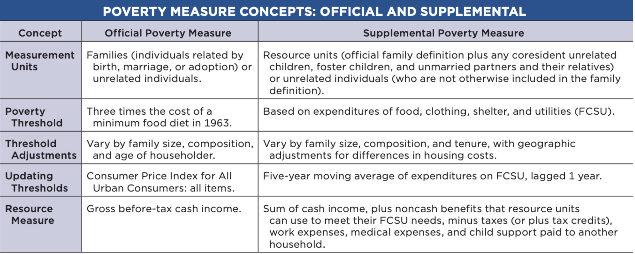
The current poverty measure–known as the “Official Poverty Measure”--was originally developed by economist Mollie Orshansky during the War on Poverty in the 1960s. At the time, the average family spent about a third of their income on food. Orshansky then surmised that a family that had three times the income necessary to pay for a “thrifty food plan” would have the resources necessary to survive. Thus, the official poverty measure was born.

Since then, the economy has changed. Due to advances in agricultural technology, the average family now spends about one-eighth of their income on food. Meanwhile, essentials like health care and housing have gone up in price over time.

Due to these changes in the economy, economists have proposed an update to the official poverty measure. This was first put forth in a 1995 National Academies study to modernize the U.S. poverty measure. The proposal put forth a number of recommendations to modernize poverty measurement in the U.S., but sat on a shelf for over a decade before being implemented.

In the late 00s, New York City calculated the New York Poverty Measure, a new measure of poverty based on the recommendations from the National Academies. Soon after, the Census Bureau calculated the first Supplemental Poverty Measure, a new measure for the United States that incorporates the recommendations of the National Academies study into a new national poverty measure.

The findings of the Supplemental Poverty Measure were a little surprising. Overall, the measure found a nationwide poverty rate very close to the official poverty measure. The real departure, though, comes when the data is disaggregated. 

For instance, child poverty is lower and elder poverty is higher in the Supplemental Poverty Measure than in the Official Poverty Measure. This is because the Supplemental Poverty Measure counts a lot of benefits programs that help families with children as income that the Official Poverty does not. It also subtracts the cost of medical out of pocket expenses from family income, which makes elderly people look poorer than the Official Poverty Measure. 

The Supplemental Poverty Measure also has big impacts on regional poverty. Because it includes a cost of living adjustment based on housing costs. This leads to poverty being much higher on the West Coast and much lower in the Midwest in the Supplemental Poverty Measure compared to the Official Poverty Measure.

The Supplemental Poverty Measure made what was possibly its biggest policy splash yet last year when the Census Bureau released its annual poverty numbers and found that the Child Tax Credit lifted two million children out of poverty in 2021.

All this matters because recently, a researcher at the conservative American Enterprise Institute published a working paper recently decrying use of the Supplemental Poverty Measure in federal policymaking. His argument is that changing from the 1960s Official Poverty Measure to the more modern Supplemental Poverty Measure would automatically increase federal spending on SNAP (formerly known as “food stamps”) and Medicaid.

What we know about the Official Poverty Measure is this: it is outdated and no longer reflects how policymakers or the public think about poverty. The Supplemental Poverty Measure comes much closer to what poverty looks like in 2023. If this is a better path forward to addressing poverty in 2023, there is no reason the U.S. should hesitate from taking it.

What do I do when data is missing?

Recently, I’ve been working on calculating the Genuine Progress Indicator (GPI) for Ohio. GPI is an alternative measure to GDP that tries to capture what is going on in an economy while adding things like the value of having an educated workforce and subtracting things like the social costs of crime.

One addition GPI makes to GDP is that adds the value of leisure time and time spent on non-market work. The unpaid time we spend doing housework or caring for children, for example. The reason we want to include these indicators is that we know these things provide value to our economy, but because money never exchanges hands they don’t get measured by  GDP.

To estimate the value of these things in the economy, we use data from the American Time Use Survey produced by the bureau of labor statistics. This survey tells us how much time Americans over the age of 15 spend on different activities.

Unfortunately, the American Time Use Survey wasn’t conducted in 2020 because of the pandemic. To make matters worse, the pandemic also led to dramatic changes in what activities people spent their time on day-to-day.

Normally with missing data, we can use the observed data we have to make some estimate for what the missing value is. We might do this by assigning the missing value as the average of our observed data.

But in this case we know that the average of the observed data is not representative of the missing data. We know that because of the shutdowns, people spent way more time at home.

In statistics, we call this type of missing data missing not at random (MNAR). Specifically, data is MNAR if it is missing because of some unobserved condition.

MNAR data is extremely hard to work with as a statistician. It essentially guarantees that there will be some bias in the final results.

One of the most common ways to deal with MNAR data is to perform sensitivity analysis. We can test what our results look like if the missing data is more or less similar to the observed data we have. This way, we can at least get an idea of what the range of reasonable results might be.

However, as is always the case with sensitivity analysis, it relies heavily on our assumptions as researchers. It is important to make those assumptions as clear as possible and to communicate how they affect the results.

In the context of the GPI study, I chose to extrapolate the data from 2020 using the other years of data. I know this is going to lead to biased results, but in the context of this particular report the single estimate isn’t as important as the overall trend.

Another reason I took this approach was because of what GPI is trying to measure. Specifically with leisure time, we are assuming that leisure time during work days could be replaced with additional work for a wage, and that people are choosing to take that leisure time instead. 

In the context of the pandemic, a lot of people weren’t really choosing to use that time for leisure necessarily. This means that not only would we have to make some assumptions about the additional time people spent at home, but we would have to adjust the way we valued that time. 

In total, I chose to acknowledge that we don’t have data for 2020 and that those particular indicators are flawed for that year. The overall story of GPI vs GDP remains unchanged, and I minimized the additional assumptions I had to make. Hopefully as more research about the pandemic becomes available, there will be a more rigorous way to address this specific problem.

The Value of a Statistical Life--for children

Earlier this year at the Society for Benefit Cost Analysis conference, I had the opportunity to listen to a representative from the Consumer Product Safety Commission (CPSC) talk about how they were approaching the idea of the Value of a Statistical Life (VSL) for children.

To be clear, VSL is not a measure of how valuable human life is. VSL is an estimate for how much we are willing to pay for reductions in the risk of death. For example, we require seat belts in cars because they are relatively low cost and reduce the probability of death quite substantially, but we do not have traffic lights at every single city intersection because that cost is too high for not enough risk reduction. For CPSC, having an accurate estimate of VSL is important for deciding whether new regulations are efficient.

VSL represents how much an average person would be willing to pay for a reduction in the risk of their own death. An individual with limited resources has to make decisions about how to spend those resources, and VSL quantifies how people make these tradeoffs using labor market data.

This is where issues arise when trying to figure out VSL for children. Children don’t have the same autonomy when it comes to decisions about their safety or how they spend resources. This makes it impossible to calculate their VSL the same way we do for adults.

One way we could approach this problem would be to ignore it and just assume children have the same VSL as adults. The issue with this is that most people would agree that we value risk reductions for children higher than we do for adults–we are willing to pay more to save a child’s life than we would to save the life of an adult.

The question then becomes the following: how much higher do we value risk reduction for children?

By reframing the question this way, we can use the same methods we use to calculate the adult VSL. The key difference is we are figuring out how much adults are willing to pay to reduce the risk of death for children.

One way we can do this is by measuring things like how much more an extra safe car seat is worth compared to an average car seat. This will tell us how much more people are willing to spend on childproofing that reduces risk of death for a child.

Estimates from the economic research on the topic have suggested that the range for child VSL is between 1.5 and 3 times the adult VSL. For the time being, CPSC has decided to use twice the adult VSL as their estimate for child VSL. Given that they just chose a round number in the middle of the range, this might be subject to change upon further research.  

There are still plenty of remaining questions about child VSL. Should there be a sliding scale between 0 and 18 years old? Is there a better way to estimate it than the willingness to pay of adults? 

It is an open topic of research, and one that is extremely important to get right. Overvaluing VSL means wasting resources on regulations that are largely ineffective, while underestimating it means living in a riskier world than we would prefer. Hopefully as more researchers begin exploring this topic, we can arrive at a well-thought-out and accurate consensus.